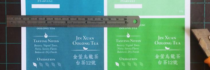
New Eco-Cha Labels. Same Great Tea!

We've gotten a lot of great feedback through emails, social media, and in person. We love that you've had a chance to voice your opinions about pretty much every aspect of Eco-Cha.
Here are the conclusions we made based on some of the feedback we got about our packaging:
- The subtle color palette is limited.
- Not enough contrast on some of the labels making the text hard to read.
- The type size is too small on the medium and small boxes.
- Update the information provided on the boxes.
The best thing about working for a small startup is the ability to really listen to our customers and act fast. We decided that with some slight changes we could address some of this feedback and make our packaging even better.
Color Theories
Initially the concept for our label color palette was that the label colors reflected the color of the brewed tea. This is a great concept and some of our customers really appreciated it. However, given that a large amount of our tea is unroasted oolong tea this left the color palette fairly limited and the color of brewed, unroasted oolong is so subtle the result was a very pale yellow.
By broadening the spectrum of color and including brighter shades we are now open to representing not just the different roast of each tea, but the general character of the tea. In some cases, such as Dong Ding Oolong, we've chosen a rich dark, blue to represent the bold roasted flavors. Whereas for Four Seasons Spring Oolong we've chosen a fresh, lighter green shade.
Wait a minute... isn't that just the same as the labels you had before but just different colors?
Yes, and no. Some of our unroasted teas have similar characteristics so it makes sense to group them together. Like Tsui Yu Jade Oolong and Shan Lin Xi High Mountain Oolong Tea, but some of our teas such as Da Yu Ling are quite different in character to the other unroasted Oolongs and with our new color palette we can highlight those differences by choosing a different label color.
Contrast Counts
The colors we've added are more vibrant which helps solve the problem we were having with the color contrast of the type.
Size Matters (type size)
This seems like an obvious fix. Just make the type bigger... This works to a point and then the label gets crowded and becomes hard to read. Using the feedback that we got about what is important to our customers we were able to refine the information on the label. For example, we found that the degree of the roast was not super important to most people, whereas many of you asked for brewing tips on the label. Of course, you'll still find important information like harvest method, region, elevation, and season.
So after a lot of time spent adjusting things we ended up with a layout that has all the important information, that's not too crowded and is easy to read.
Here is a sneak peak at the finished result.
Let us know what you think and if you like the new labels!


